
Winchester College
Overview
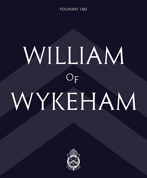
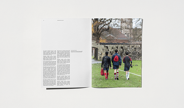
World-famous boarding school Winchester College take the idea of heritage to new heights. Founded in 1382, they are the UK’s oldest private school, with over 600 years of educating and preparing young boys to go out into the world and make it their own.
Therefore, this was a project that required sensitivity. The challenge at hand was not one of reinvention or transformation but rather of distilling their essence. Our approach? Uncover the secret that has made the school so enduring and bring that to life through language, visuals and digital.
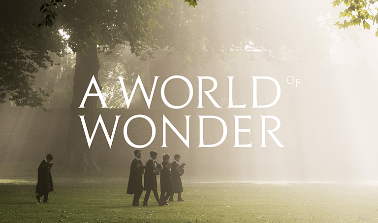
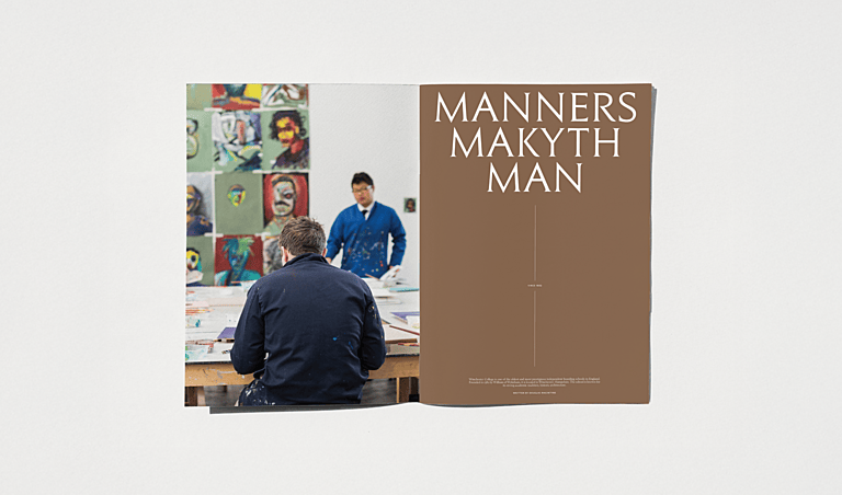
Whilst known for their academic excellence, it steadily became clear to us that Winchester College offered so much more than a strong curriculum. Their pupils are taught to think, to converse, to question, and to pursue what fascinates them actively, throughout their lives. There is an emphasis on cultivating a love for learning—so much so, they have a unique teaching method called Div designed to encourage discussion, debate and learning for its own sake.
Students are seen as curious minds, and Winchester College teaches them to wonder.
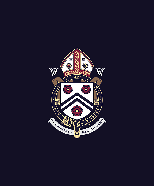
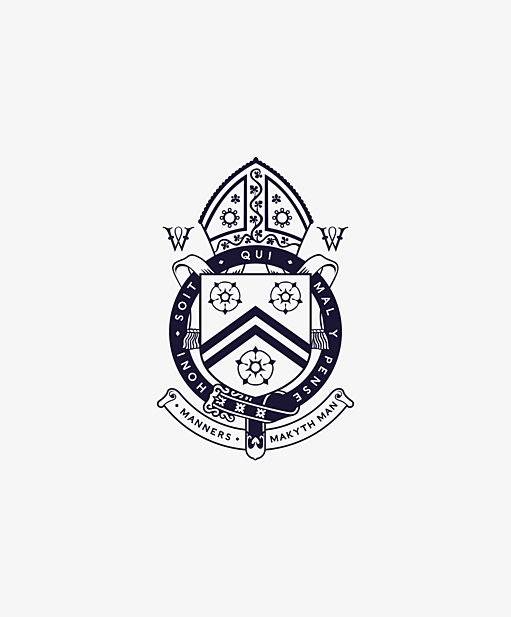
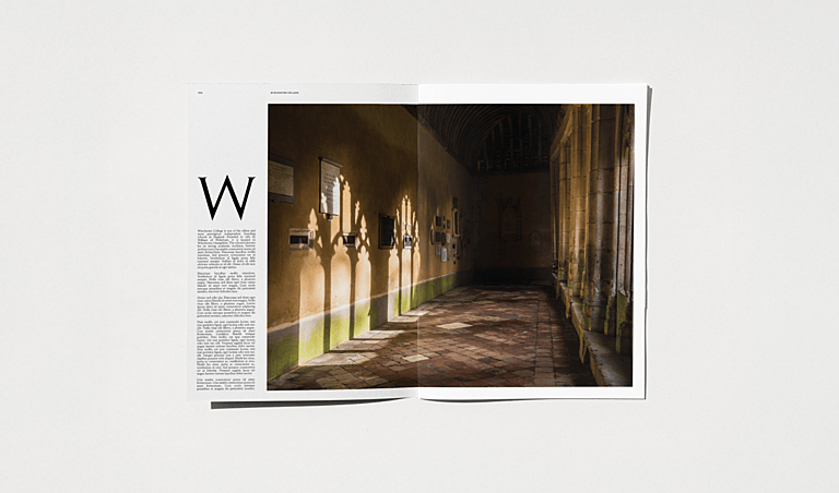
We were focused on dignifying and doing justice to their incredible heritage, whilst animating it for a modern audience. Taking an evolutionary rather than revolutionary approach, we re-crafted the logo and crest to add a touch of elegance to otherwise timeless motifs. The colour palette was inspired by the historic surroundings of the school, including Warm Flint and Wykeham Red, as well as the all-important Winchester Blue.
With a feeling of exploration, discovery and investigation captured through language and aesthetics, the website was a grounding force that allowed parents searching for information to locate what they needed with ease. Through intuitive UX and transformed site structures, we brought clarity to a complex application process.
- A 213% increase in website users YoY
- A 41% increase in users from organic search YoY
- A 2.1k open day bookings registered via the new website
- 80k prospectus downloads
Overview
World-famous boarding school Winchester College take the idea of heritage to new heights. Founded in 1382, they are the UK’s oldest private school, with over 600 years of educating and preparing young boys to go out into the world and make it their own.
Therefore, this was a project that required sensitivity. The challenge at hand was not one of reinvention or transformation but rather of distilling their essence. Our approach? Uncover the secret that has made the school so enduring and bring that to life through language, visuals and digital.
Whilst known for their academic excellence, it steadily became clear to us that Winchester College offered so much more than a strong curriculum. Their pupils are taught to think, to converse, to question, and to pursue what fascinates them actively, throughout their lives. There is an emphasis on cultivating a love for learning—so much so, they have a unique teaching method called Div designed to encourage discussion, debate and learning for its own sake.
Students are seen as curious minds, and Winchester College teaches them to wonder.
We were focused on dignifying and doing justice to their incredible heritage, whilst animating it for a modern audience. Taking an evolutionary rather than revolutionary approach, we re-crafted the logo and crest to add a touch of elegance to otherwise timeless motifs. The colour palette was inspired by the historic surroundings of the school, including Warm Flint and Wykeham Red, as well as the all-important Winchester Blue.
With a feeling of exploration, discovery and investigation captured through language and aesthetics, the website was a grounding force that allowed parents searching for information to locate what they needed with ease. Through intuitive UX and transformed site structures, we brought clarity to a complex application process.
- A 213% increase in website users YoY
- A 41% increase in users from organic search YoY
- A 2.1k open day bookings registered via the new website
- 80k prospectus downloads

