
Somebody
Overview
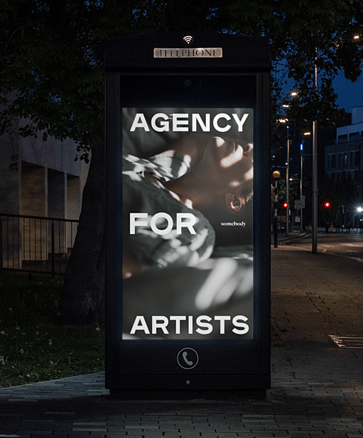
The entertainment industry is a world of glamour and grit—countless aspiring actors set out with a dream, but only a select few get to stand in the spotlight. After years of launching careers through their well-established extras agency, Mad Dog 2020 came to us with a vision to launch an actors-only division. Working hand-in-hand with their show-business-trained team, we embarked on a journey of naming, positioning and designing their breakout venture.
This is a business of identifying the unidentifiable—how do you know if an actor is worth putting forward for a role? What do you look for? As actors and drama teachers themselves, they explored this question with deep empathy for their audience. Through a number of animated, practical working sessions, we managed to pin down the idea that would drive development: star quality. A lead actor has something special that’s hard to put your finger on; a magic, an essence, that everyone around them can feel.
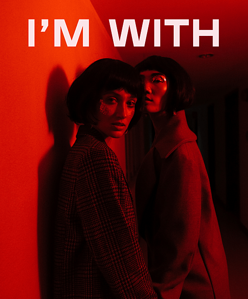
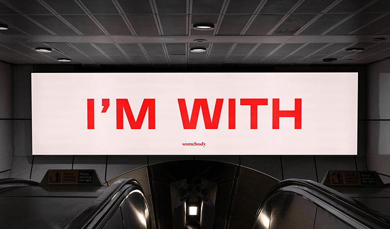
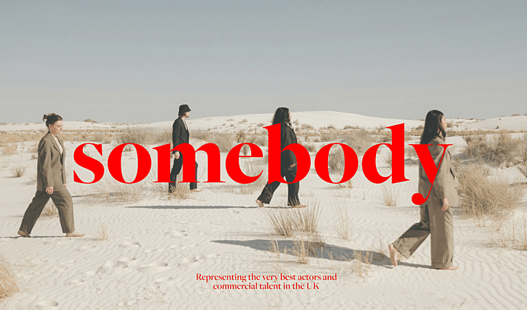
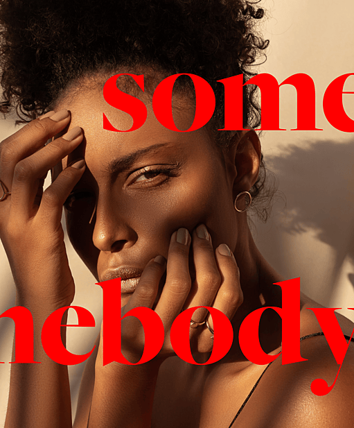
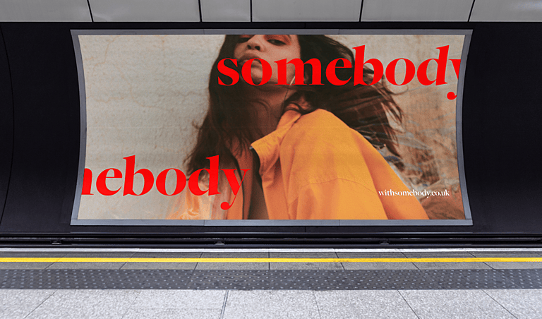
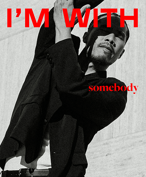
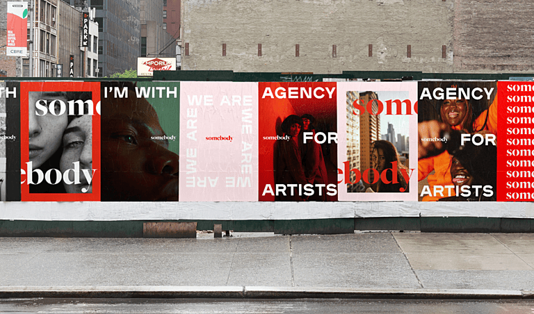
Working our way from a longlist to a shortlist, moving from creative ideation to domain checks, we eventually committed to Somebody. It spoke to the power of star quality—‘nobody’ could become somebody—but without being elitist, because everybody is somebody. It also hinted at their selective approach and role as an agency that would be by your side throughout: I’m With Somebody.
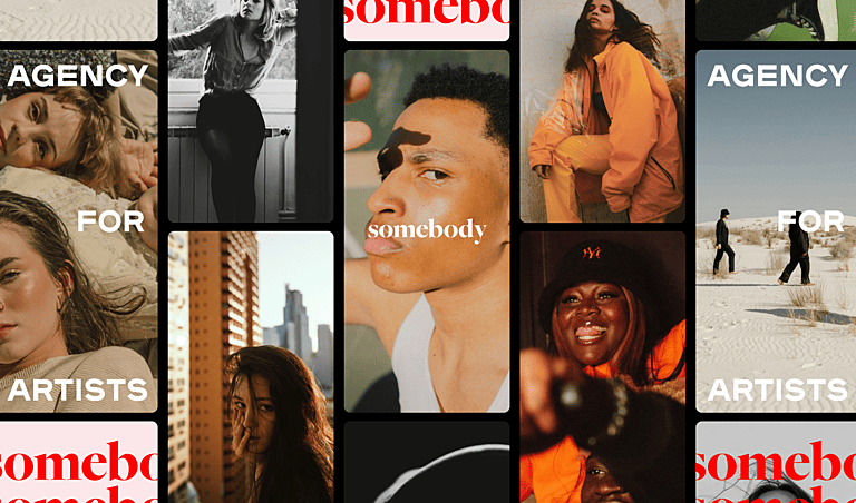
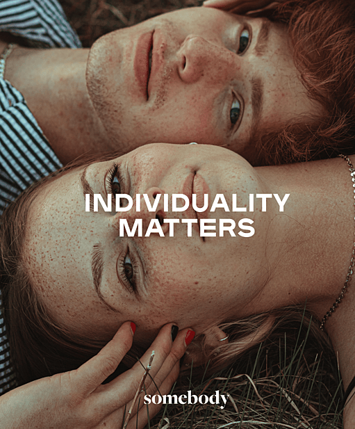
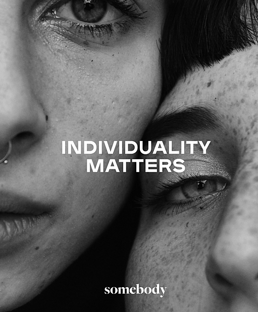
Most agencies put forward stereotypes for roles, and Somebody was passionate about defending difference and pushing against the gender, ethnicity and ability boundaries of conventional casting. They are true allies to their artists, which gave birth to their core brand belief: Championing the Individual.
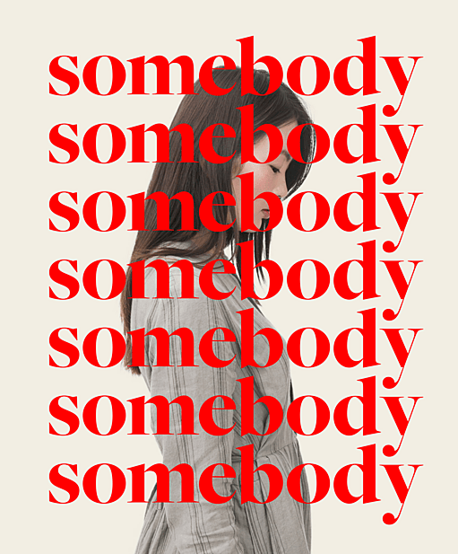
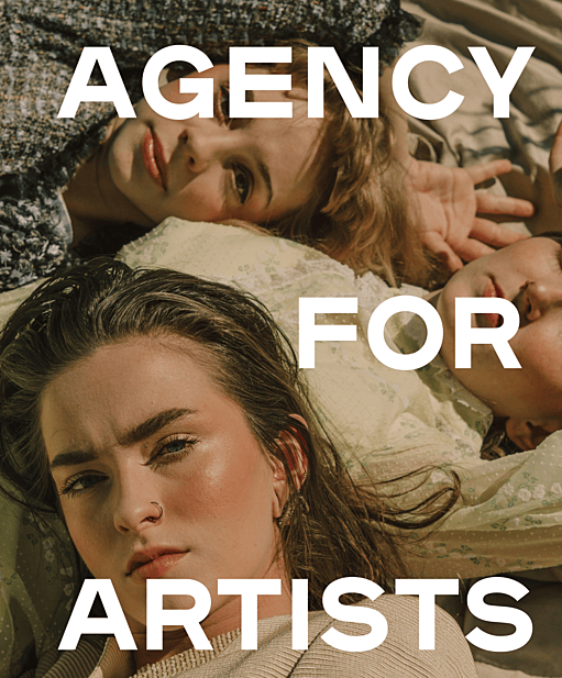
We set out to capture their activist spirit—this was a brand born in the extraordinary times of the 2020 social justice movement. We opted for a two-tone colour palette that ‘broke’ design rules and paired it with an uppercase font that inserted energy into all messages. Playful typography further cemented their progressive, disruptive feel.
Amplifying their ‘for the people’ spirit, we defined their Tone Of Voice as Warmly Rebellious. That meant playing with the unexpected and ensuring copy felt anti-traditional and youthful. Importantly, rebellion wasn’t about tearing down but more about building up and being an ally.
"Thursday take the essence of company brand objectives and effortlessly translates these into a product that is exciting and hits the nail on the head. The process itself takes great care to communicate each step with us as a client, and the result is always carefully thought out and achieves bringing ideas to life with great skill".
Overview
The entertainment industry is a world of glamour and grit—countless aspiring actors set out with a dream, but only a select few get to stand in the spotlight. After years of launching careers through their well-established extras agency, Mad Dog 2020 came to us with a vision to launch an actors-only division. Working hand-in-hand with their show-business-trained team, we embarked on a journey of naming, positioning and designing their breakout venture.
This is a business of identifying the unidentifiable—how do you know if an actor is worth putting forward for a role? What do you look for? As actors and drama teachers themselves, they explored this question with deep empathy for their audience. Through a number of animated, practical working sessions, we managed to pin down the idea that would drive development: star quality. A lead actor has something special that’s hard to put your finger on; a magic, an essence, that everyone around them can feel.
Working our way from a longlist to a shortlist, moving from creative ideation to domain checks, we eventually committed to Somebody. It spoke to the power of star quality—‘nobody’ could become somebody—but without being elitist, because everybody is somebody. It also hinted at their selective approach and role as an agency that would be by your side throughout: I’m With Somebody.
Most agencies put forward stereotypes for roles, and Somebody was passionate about defending difference and pushing against the gender, ethnicity and ability boundaries of conventional casting. They are true allies to their artists, which gave birth to their core brand belief: Championing the Individual.
We set out to capture their activist spirit—this was a brand born in the extraordinary times of the 2020 social justice movement. We opted for a two-tone colour palette that ‘broke’ design rules and paired it with an uppercase font that inserted energy into all messages. Playful typography further cemented their progressive, disruptive feel.
Amplifying their ‘for the people’ spirit, we defined their Tone Of Voice as Warmly Rebellious. That meant playing with the unexpected and ensuring copy felt anti-traditional and youthful. Importantly, rebellion wasn’t about tearing down but more about building up and being an ally.
"Thursday take the essence of company brand objectives and effortlessly translates these into a product that is exciting and hits the nail on the head. The process itself takes great care to communicate each step with us as a client, and the result is always carefully thought out and achieves bringing ideas to life with great skill".

