Rugby School
Overview
Rugby School approached us initially to rethink their website. But it quickly became clear that the opportunity was bigger than digital alone.
With centuries of heritage, a distinctive philosophy and a growing international presence, Rugby needed a more coherent way to express who it is today across brand, communications and digital.
At the heart of the work was one powerful idea: The Whole Person is the Whole Point. A philosophy that runs through the school and its approach to education, encouraging students to develop character, curiosity, courage and confidence alongside academic achievement.
Our role grew into a broader refinement of the Rugby brand, evolving its visual language, defining a new photographic direction, creating a clearer structure for the wider Rugby School Group and translating it all into a new digital experience.
The challenge was to move the brand forward without losing what made it recognisably Rugby.
Rugby is defined by much more than academic performance.
Its philosophy is built around developing the whole person: giving students the freedom to experience widely, discover new strengths and ultimately find the things they want to pursue more deeply.
That idea of breadth, then depth runs through life at Rugby, from sport, music and theatre to community programmes and the House system.
There is also a particular character to the school itself: grounded, straightforward and ambitious without being showy. Rugby’s own narrative talks about having “a uniform but not seeking uniformity”, strong opinions loosely held, and the importance of the everyday conversations and experiences that shape young people.
That gave us a clear creative principle. This wasn’t about inventing a new personality for Rugby. It was about creating a brand system capable of expressing the one already there.
Rugby already had powerful and recognisable brand assets. Our job was to build a more contemporary, flexible system around them.
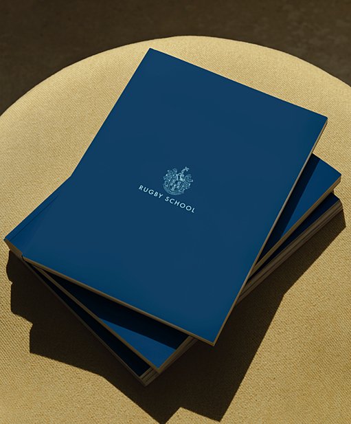
The existing crest and Rugby School lock-up were retained, while their use was refined and formalised across different formats, alignments and applications. Around that, we developed a broader visual language spanning colour, typography, photography and brand rollout.
Rugby Navy remains central to the identity, supported by a softer palette of Rugby Blue, Bright Blue, Stone and Duck Egg, giving the brand more range while retaining its authority.
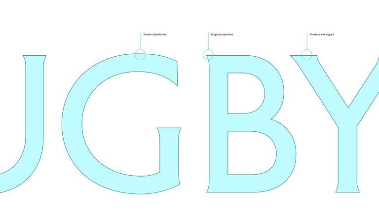
Typography became a major part of the new expression. Petit Serif gives Rugby a distinctive voice at hero scale, Ivy Presto adds a more editorial quality to longer titles and quotes, and Hanken Grotesk brings clarity to body copy and everyday communications.
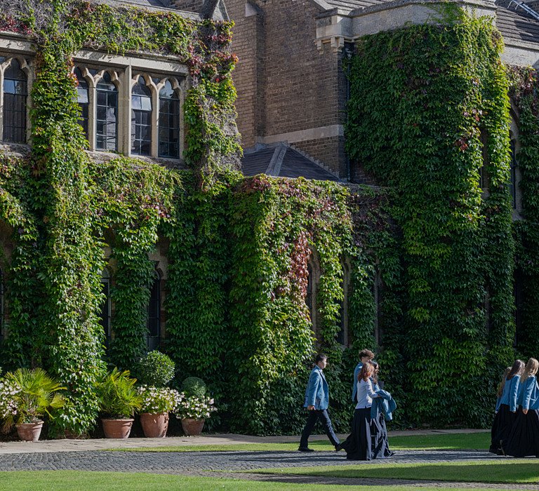
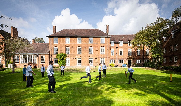
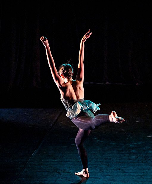
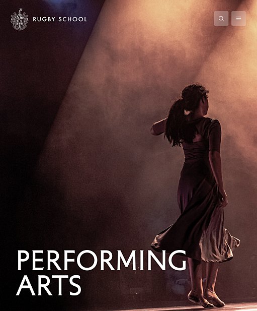
We also developed a new photographic direction and commissioned dedicated shoots around it, moving away from overly staged education imagery towards candid, emotionally resonant moments that capture character, curiosity, courage and kindness.
The work extended beyond Rugby School itself. We created a clearer brand architecture for the wider Rugby School Group, defining how Rugby School Global, Global Partnerships and individual schools could sit within one coherent system. A distinct burnt orange and copper expression gave the Group its own identity while retaining clear links back to Rugby.
Finally, we explored how the identity could roll out across different touchpoints, from publications and campaigns to stationery, signage and digital communications creating a practical toolkit for consistent future use.
The website became the place where all of this came together.
Rugby has an enormous amount to communicate: academic pathways, admissions, Houses, sport, music, performing arts, community programmes, bursaries, events and everyday school life.
Our challenge was to make that breadth feel exciting rather than overwhelming.
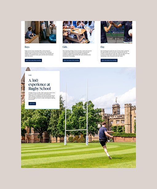
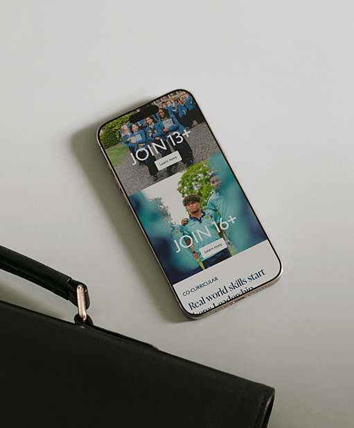
We rethought the structure of the site around the journeys families actually make, balancing storytelling with clear access to practical information. Admissions was deliberately kept visible throughout the experience, making it easy for prospective families to move from discovery into action.
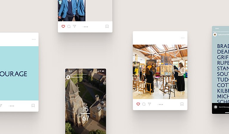
The refreshed identity gave us a much stronger digital toolkit to work with; expressive typography, a more flexible colour palette, a distinctive image style and a clearer visual hierarchy.
Rather than treating the website as a separate piece of design, we built it as an extension of the brand itself.
The result is an experience that allows users to explore freely while still finding what they need quickly, communicating not just what Rugby offers, but what life there actually feels like.
The refreshed identity gives the digital experience a stronger sense of character, while the new structure makes a complex school easier to explore. Prospective families can move more naturally between inspiration and practical information, with admissions kept visible throughout and key areas of school life given space to breathe.
The result is a website that feels more coherent, more intuitive and more reflective of Rugby itself — combining heritage, personality and clarity in one experience.
More than simply a new front end, it gives Rugby a stronger digital platform for telling its story, supporting admissions and expressing The Whole Person is the Whole Point in a way that feels relevant today.







Overview
Rugby School approached us initially to rethink their website. But it quickly became clear that the opportunity was bigger than digital alone.
With centuries of heritage, a distinctive philosophy and a growing international presence, Rugby needed a more coherent way to express who it is today across brand, communications and digital.
At the heart of the work was one powerful idea: The Whole Person is the Whole Point. A philosophy that runs through the school and its approach to education, encouraging students to develop character, curiosity, courage and confidence alongside academic achievement.
Our role grew into a broader refinement of the Rugby brand, evolving its visual language, defining a new photographic direction, creating a clearer structure for the wider Rugby School Group and translating it all into a new digital experience.
The challenge was to move the brand forward without losing what made it recognisably Rugby.
Rugby is defined by much more than academic performance.
Its philosophy is built around developing the whole person: giving students the freedom to experience widely, discover new strengths and ultimately find the things they want to pursue more deeply.
That idea of breadth, then depth runs through life at Rugby, from sport, music and theatre to community programmes and the House system.
There is also a particular character to the school itself: grounded, straightforward and ambitious without being showy. Rugby’s own narrative talks about having “a uniform but not seeking uniformity”, strong opinions loosely held, and the importance of the everyday conversations and experiences that shape young people.
That gave us a clear creative principle. This wasn’t about inventing a new personality for Rugby. It was about creating a brand system capable of expressing the one already there.
Rugby already had powerful and recognisable brand assets. Our job was to build a more contemporary, flexible system around them.
The existing crest and Rugby School lock-up were retained, while their use was refined and formalised across different formats, alignments and applications. Around that, we developed a broader visual language spanning colour, typography, photography and brand rollout.
Rugby Navy remains central to the identity, supported by a softer palette of Rugby Blue, Bright Blue, Stone and Duck Egg, giving the brand more range while retaining its authority.
Typography became a major part of the new expression. Petit Serif gives Rugby a distinctive voice at hero scale, Ivy Presto adds a more editorial quality to longer titles and quotes, and Hanken Grotesk brings clarity to body copy and everyday communications.
We also developed a new photographic direction and commissioned dedicated shoots around it, moving away from overly staged education imagery towards candid, emotionally resonant moments that capture character, curiosity, courage and kindness.
The work extended beyond Rugby School itself. We created a clearer brand architecture for the wider Rugby School Group, defining how Rugby School Global, Global Partnerships and individual schools could sit within one coherent system. A distinct burnt orange and copper expression gave the Group its own identity while retaining clear links back to Rugby.
Finally, we explored how the identity could roll out across different touchpoints, from publications and campaigns to stationery, signage and digital communications creating a practical toolkit for consistent future use.
The website became the place where all of this came together.
Rugby has an enormous amount to communicate: academic pathways, admissions, Houses, sport, music, performing arts, community programmes, bursaries, events and everyday school life.
Our challenge was to make that breadth feel exciting rather than overwhelming.
We rethought the structure of the site around the journeys families actually make, balancing storytelling with clear access to practical information. Admissions was deliberately kept visible throughout the experience, making it easy for prospective families to move from discovery into action.
The refreshed identity gave us a much stronger digital toolkit to work with; expressive typography, a more flexible colour palette, a distinctive image style and a clearer visual hierarchy.
Rather than treating the website as a separate piece of design, we built it as an extension of the brand itself.
The result is an experience that allows users to explore freely while still finding what they need quickly, communicating not just what Rugby offers, but what life there actually feels like.
The refreshed identity gives the digital experience a stronger sense of character, while the new structure makes a complex school easier to explore. Prospective families can move more naturally between inspiration and practical information, with admissions kept visible throughout and key areas of school life given space to breathe.
The result is a website that feels more coherent, more intuitive and more reflective of Rugby itself — combining heritage, personality and clarity in one experience.
More than simply a new front end, it gives Rugby a stronger digital platform for telling its story, supporting admissions and expressing The Whole Person is the Whole Point in a way that feels relevant today.
